
Thyme Savers
Feb 8th - 3 week sprint
3 Person Team - Team Coordinator, UX Researcher, & Me
My Role - UX Designer
The Challenge
Cooking takes so much time. The time needed to clean the dishes after cooking only adds to the problem. Then comes to finding a good recipe, how can you know what is good?
The Outcome
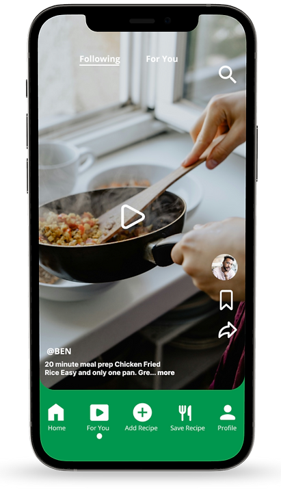
Thyme Saver can give you simple one-pot recipes that save time and money but don’t skimp on flavor. Thyme Saver allows you to browse other recipes people have reviewed with step-by-step instructional videos.
Getting into the mindset
Who would use our app and why?


Creating an Artistic Direction
Moodboard
User Research
Objectives:
Understand where people struggle with cooking
Learn the process that people use to cook
Learn the habits of people cooking
Figure out how people choose what to eat
Figure out the reason why people cook

What does the data tell us?
For our hardworking, single teacher in his mid-20s, cooking at home in a efficient and cost-effective manner is crucial.
Since he dedicates so much time to his career and extracurricular activities, he finds the process of cooking at home overwhelming due to time constraints.
The burdensome tasks of recipe searching, grocery shopping, cooking, and cleanup simply take too much time. He wants to bring a fun new meal for the school potluck. He needs to cook something quick and simple.

Problem Statement
In response to the needs of busy, working individuals seeking simplicity and ease in cooking, our app aims to provide accessible, budget-friendly recipe inspiration with fewer ingredients.
The app will also offer features such as recipe uploads, a curated video “For You Page” for cooking inspiration, and solutions for minimizing dish cleanup.
This empowers users to share and explore recipes while increasing efficiency and staying within budget.

Empathy Map
We then synthesized an empathy map from the data in the affinity diagram to give us an idea of one target user going through the cooking process


Creating a Design
What will the app look like?
How will it function?
Competitive Analysis
Company | URL | Product | Quality | Service |
|---|---|---|---|---|
Epicurious | https://www.epicurious.com/ | - Clean, Simple - Offers trending recipes and dietary restriction filters | - Quick and easy user control - Click into recipes and easily can click back button - Clear division of titles and sub sections | - “Ultimate recipe resource for curious home cooks” - Recipes based off preferences and dietary restrictions - Video recipes |
Tasty | https://tasty.co/ | - Understable navigations - Good to make meal plans - Simple design, not super aesthetic | - Can email feedback, but no help page - Easy to access settings through profile - Makes page customizable to user preference | - Recipes and cooking videos - Tasting community - Affordable recipes |
Cookpad | https://cookpad.com/us/homepage | - Simple, clean design - Step by step recipes | - Easy back and forth navigation - Most icons are easy to follow, but some confusing - share is like a camera with a heart in it? | - “Find and share recipes” - Search by ingredients - Have own and saved recipes in one place. |

Brainstorming
As a team we brainstormed functions that would save the user time in the kitchen. Would we use voice activated commands? Gestures? One tap controls? How would the app work as someone was cooking? Could users use the app even if their hands were dirty from prepping ingredients?
These are some of the questions we asked ourselves as we decided what functions to include in the app.
Digital Wireframes

Prototype

User Research
Objective: Figure out user pain points during the navigation and onboarding process
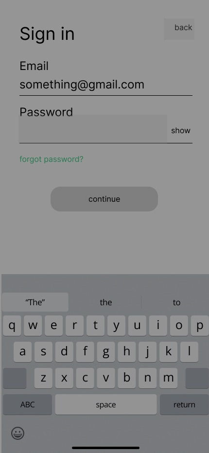
Task 1: Create an account
Task 2: Find a recipe and save it
Task 3: Follow a recipe until completed
Task 4: Navigate through the main tabs
Key Learnings
- Making button action clear
- Clarity of titles
- Show length of video
The difference between confusion and comprehension could be one letter
Intuitive Titles
The difference between confusion and comprehension could be one leter


Recognition
Made a navigation interaction recognition instead of having to teach a new interaction
Final Design


Accessibility
Sorting by price can make it easy to cook on a budget